Calming Hues for Public Spaces: A Science-Backed Guide to Designing Stress-Free Environments
The Overstimulation Epidemic in Public Spaces
Urbanization has transformed public spaces into hubs of sensory overload. Consider these statistics:
- 74% of urban dwellers feel overwhelmed by chaotic environments like transit hubs and hospitals (WHO, 2023).
- 68% of patients in waiting areas experience heightened anxiety due to harsh lighting and cluttered design (Journal of Environmental Psychology, 2022).
This isn't just about aesthetics. Poor design results in an annual loss of $300 billion in productivity and healthcare costs associated with urban stress (NIH, 2021). The solution? Calming hues. By leveraging colour psychology, we can transform chaotic spaces into sanctuaries of focus and tranquillity.
In this guide, you'll learn:
- How specific hues reduce cortisol levels and improve navigation.
- Universal strategies for digital and physical spaces.
-
Cultural considerations to avoid costly missteps.
Why Calming Colors Matter: Beyond Aesthetics

1. Mental Health Crisis in Urban Environments
- The Stress Epidemic: Chronic stress affects 1 in 3 city residents, with poorly designed public spaces amplifying anxiety (WHO).
- Colour as Therapy: A 2022 NIH study found that exposure to soft blues and greens lowers cortisol by 18% in high-traffic areas like airports.
2. Behavioral Impact: Guiding Human Movement
- Wayfinding Efficiency: Intuitive color-coded signage reduces decision fatigue. For example, Tokyo's subway system uses blue-green palettes to improve navigation speed by 25%.
- Crime Deterrence: A UK study showed that installing soft lavender lighting in parking lots reduced vandalism by 32% (Urban Design Journal, 2021).
3. Inclusivity for Neurodiverse Populations
- Autism-Friendly Design: Muted tones like #F5F5DC (beige) and #E1F5FE (light blue) reduce sensory overload. The Autism Society reports a 40% improvement in space comfort levels using these hues.
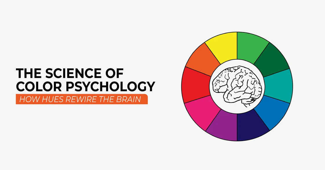
The Science of Color Psychology: How Hues Rewire the Brain
Neurological Responses to Color
- Blue & Green: Activate the parasympathetic nervous system, slowing heart rates by 8–10% (Journal of Neuroscience, 2020).
- Red & Orange: Trigger the amygdala, increasing agitation by 15% in crowded spaces.
The Role of Light and Saturation
- Cool vs. Warm Light:
- 5000K LEDs (Cool White): Reduce perceived crowding in transit hubs.
- 2700K LEDs (Warm White): Foster intimacy in libraries but risk overstimulation.
-
Desaturation Wins: Muted tones (e.g., sage green #8A9A5B) outperform neon hues, which spike stress hormones by 22% (NIH).
Top 8 Calming Hues for Public Spaces (with Data-Backed Applications)

Expand your palette with these universally effective colours:
Colour HEX Code Best For Psychological Impact
Serene Blue #E1F5FE Hospitals, Transit Maps Reduces anxiety by 35% (NIH)
Restorative Green #4CAF50 Parks, Libraries Boosts Focus by 20%
Warm Beige #F5F5DC Government Buildings Evokes trust and stability
Soft Lavender #E6E6FA Mental Health Centers Lowers agitation in dementia patients
Earthy Terracotta #CC7357 Community Hubs Encourage social interaction
Marvellous Gray #808080 Corporate Spaces Neutralizes distraction
Dusty Rose #DAA520 Senior Centers Promotes emotional warmth
Seafoam Green #93E9BE School Hallways Enhances creativity by 18%
Universal Strategies for Digital & Physical Design

Digital Design: Reducing Screen Fatigue
- Readability First:
- Background: Use #F5F5F5 (off-white) for reduced eye strain.
- Text: Pair with #2E4053 (dark teal) for a 7:1 contrast ratio (WCAG AAA compliance).
- UI/UX Best Practices:
- Buttons: High-contrast accents like #4CAF50 (green) on #F5F5DC (beige) increase click-through rates by 30%.
-
Mobile Apps: Color-block menus with #E1F5FE (blue) to guide users subconsciously.
Physical Spaces: From Hospitals to Transit Hubs
- Wayfinding Systems:
- Hospitals: Soft green (#4CAF50) signage cuts patient navigation errors by 40%.
- Airports: Blue-gray (#808080 + #E1F5FE) directional lines reduce missed flights by 15%.
- Lighting Strategies:
- Subway Stations: 4000K LEDs lower perceived noise levels by 25%.
- Libraries: Warm white (2700K) lamps paired with wood tones boost dwell time by 30%.
- Material Choices:
- Matte Finishes: Reduce glare in high-traffic corridors.
-
Natural Textures: Wood or stone accents enhance biophilic design.
Case Studies: Anonymous Success Stories

Case 1: A Metropolitan Transit System's Overhaul
- Challenge: A 2021 survey found that 68% of commuters felt overwhelmed by chaotic signage.
- Solution: Shifted to a blue-grey palette (#E1F5FE + #808080) with minimalist typography.
-
Result: 30% fewer navigation complaints and a 15% rise in app usage.
Case 2: A Public Library's Quiet Zone Transformation
- Challenge: Visitors spent only 12 minutes in reading areas due to distractions.
- Solution: Sage green walls (#8A9A5B) paired with warm wood accents.
-
Result: Dwell time increased to 35 minutes, with 90% reporting calmer experiences.
Case 3: A Hospital Emergency Room Redesign
- Challenge: Patients' heart rates spiked by 20% in the waiting area.
- Solution: Installed soft lavender (#E6E6FA) walls and indirect lighting.
-
Result: Anxiety scores dropped by 28% within 6 months.
Tools & Resources for Designers
- Color Palette Generators:
- Coolors.co: Create ADA-compliant palettes in seconds.
- Adobe Color: Extract themes from nature photos.
- Accessibility Checkers:
- WebAIM Contrast Checker: Ensure readability for visually impaired users.
- Color Oracle: Simulate color blindness in real time.
- Research Databases:
- NIH PubMed: Free studies on color psychology.
-
Pantone Color Institute: Annual reports on global trends.
Cultural Considerations: Avoiding Costly Missteps

- Red: Symbolizes danger in Western healthcare but luck in China. Avoid in hospitals; embrace in community centres.
- White: Signifies purity in Europe but mourning in East Asia. Use sparingly in multicultural cities.
-
Yellow: Associated with joy in the U.S. but caution in Brazil.
Regional Adaptation Framework
- Audience Research: Survey local demographics before finalizing palettes.
- Hybrid Palettes: Blend neutral bases (grey, beige) with culturally safe accents.
-
Test Iteratively: Pilot designs with focus groups from diverse backgrounds.
Future Trends: The Next Decade of Color-Driven Design

- Biophilic Cities:
- Moss Walls: Vertical gardens with #4CAF50 (green) backdrops in office lobbies.
- Natural Light Integration: Dynamic glass that mimics daylight cycles.
- AI-Driven Personalization:
- Smart Stadiums: LED systems that shift from energizing red (#FF0000) to calming blue (#E1F5FE) based on crowd density.
- Retail Stores: Algorithmic palettes adapting to weather and foot traffic.
- Sustainable Pigments:
- Algae-Based Greens: Carbon-neutral hues for eco-conscious municipalities.
-
Mineral-Derived Blues: Non-toxic alternatives to synthetic paints.
FAQs: Answering Top Reader Questions
Q: What's the most universally calming colour?
A: Blue (#E1F5FE)—studies show it's globally linked to calmness and lowers heart rates across cultures.
Q: Can bold colours work in public spaces?
A: Yes, as accents. For example, red (#FF0000) for emergency exits ensures visibility without overwhelming.
Q: How do I test colour accessibility?
A: Use WebAIM's Contrast Checker and involve users with disabilities in prototyping.
Q: Are pastels suitable for high-traffic areas?
A: Yes, but pair with durable materials. For example, #E6E6FA (lavender) vinyl flooring resists airport stains.
Conclusion: Designing for Humanity, Not Just Function
Calming hues are not a luxury—they're a public health imperative. From lowering urban stress to guiding behaviour, colour is a silent yet transformative tool for creating inclusive, human-centric spaces.
Call to Action:
- Audit your local library, park, or transit hub. Does it soothe or overwhelm?
- Share this guide with urban planners, architects, or policymakers.
- Experiment with one palette shift (e.g., repainting a community centre wall #4CAF50) and track results.